How can I make a festival goer feel more
Lush-cious?
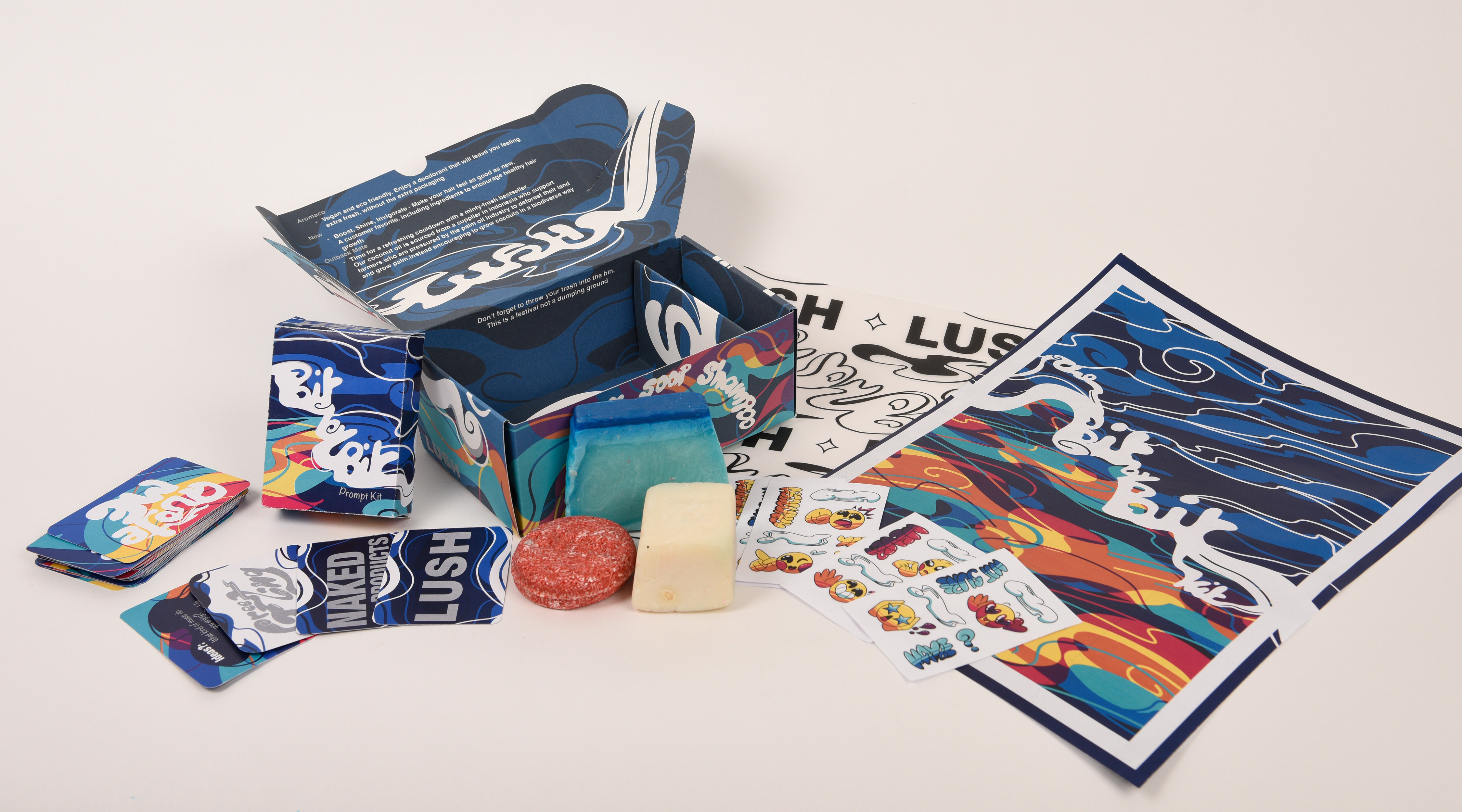
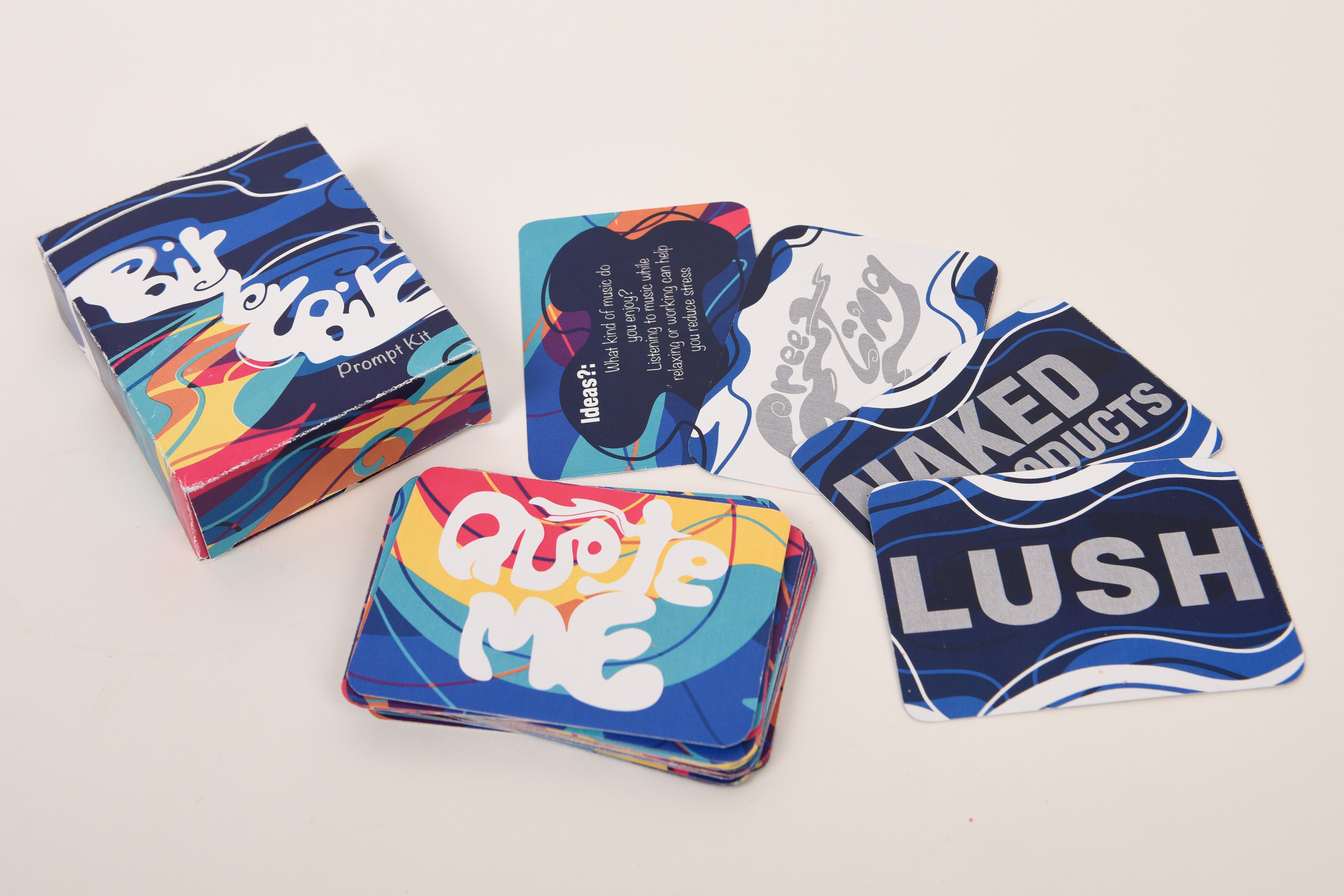
Bit by Bit is my wellbeing toolkit created to be sold by Lush at festivals, with a focus on self confidence and helping people be true their inner selves
8 Jan - 4 March
Lush
Area of focus - Print, Packaging, typography, illustration, Mental health, Self confidence
Create a toolkit for festival goers who struggle with self confidence, to not only be used during a festival but for the long term too.
Packaging
Typography
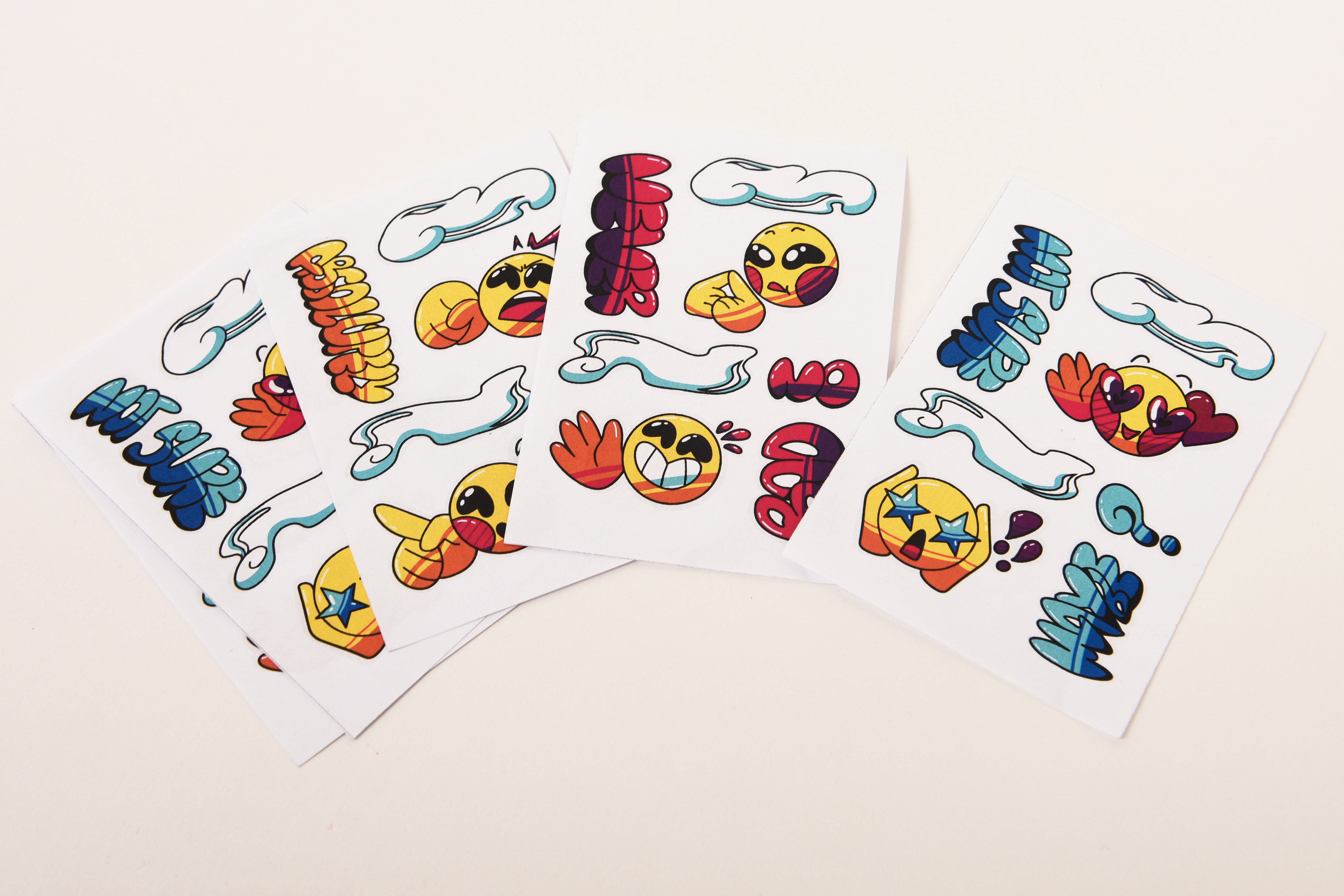
Illustration
Mental Health
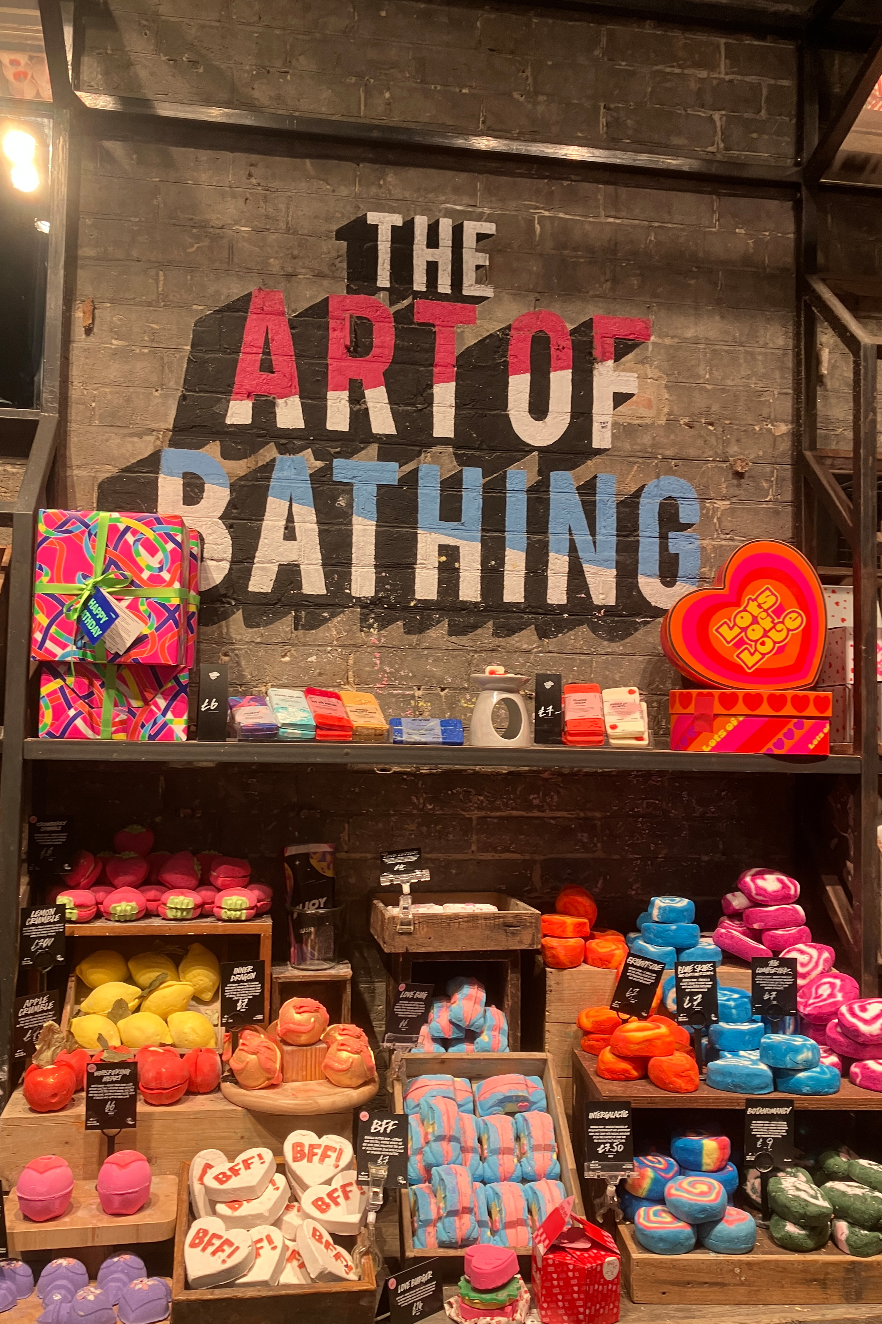
To collect research, I visited the Lush store in Bournemouth to check out their products as well and ask the staff a few questions about their most popular products.
We also got a tour around both Lush and Dayfold to see how their operations work.
As a part of my research I also looked into different festivals to choose which would be best to aim my wellbeing toolkit at, and I settled on Womad, the worlds festival.
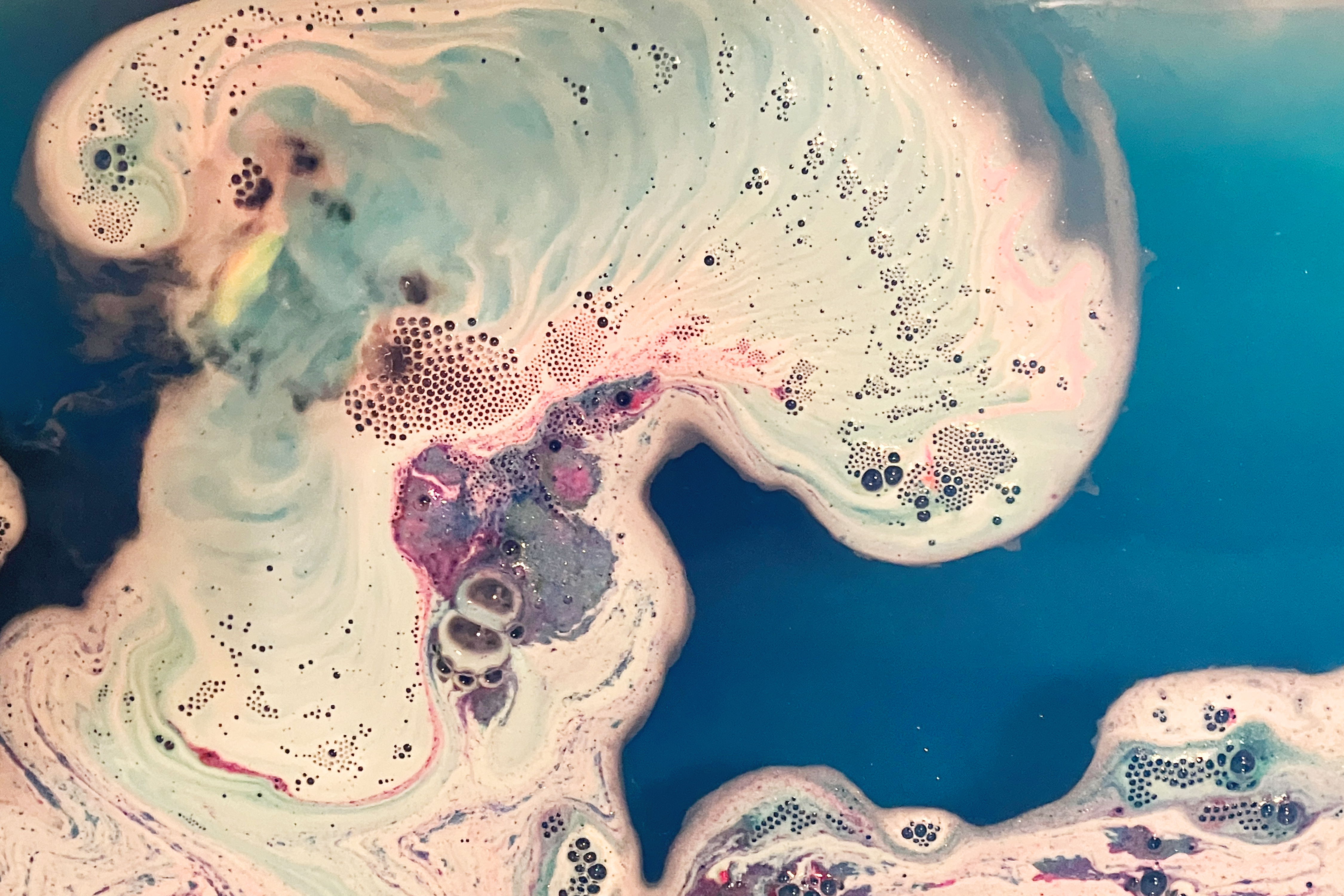
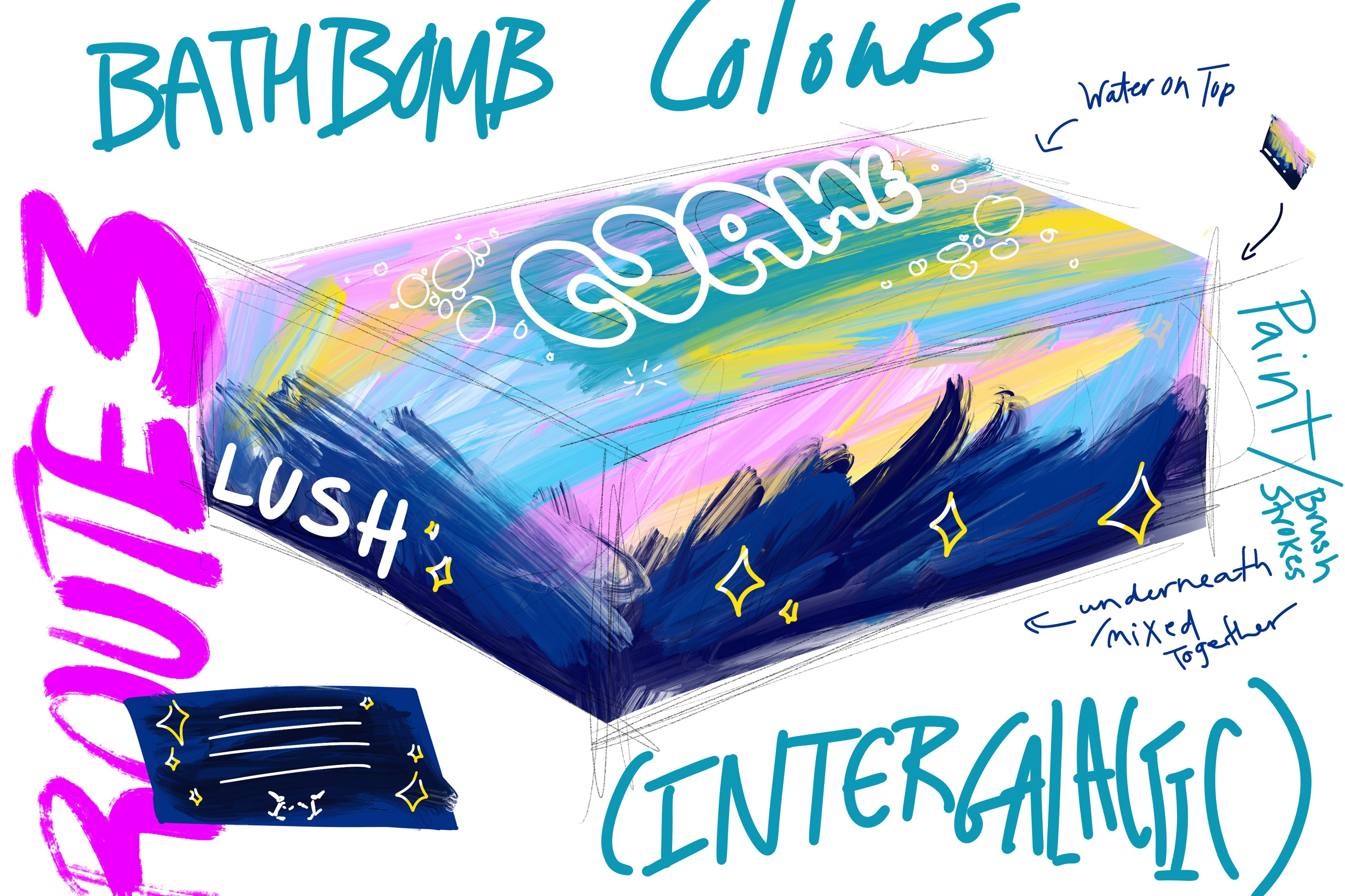
I also bought a galaxy bath bomb, their best seller, and used some of the patterns and colours that came from it to inform my designs
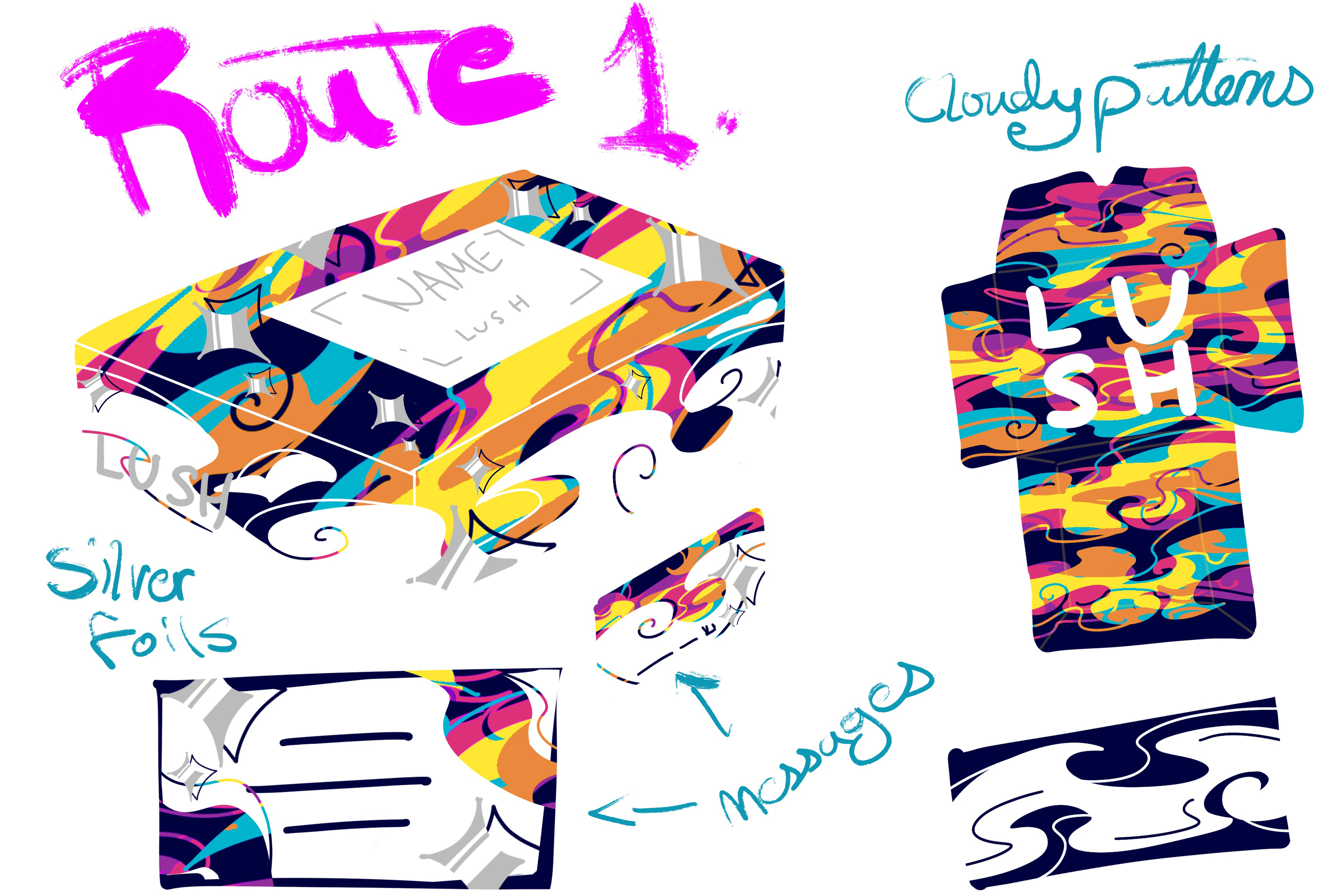
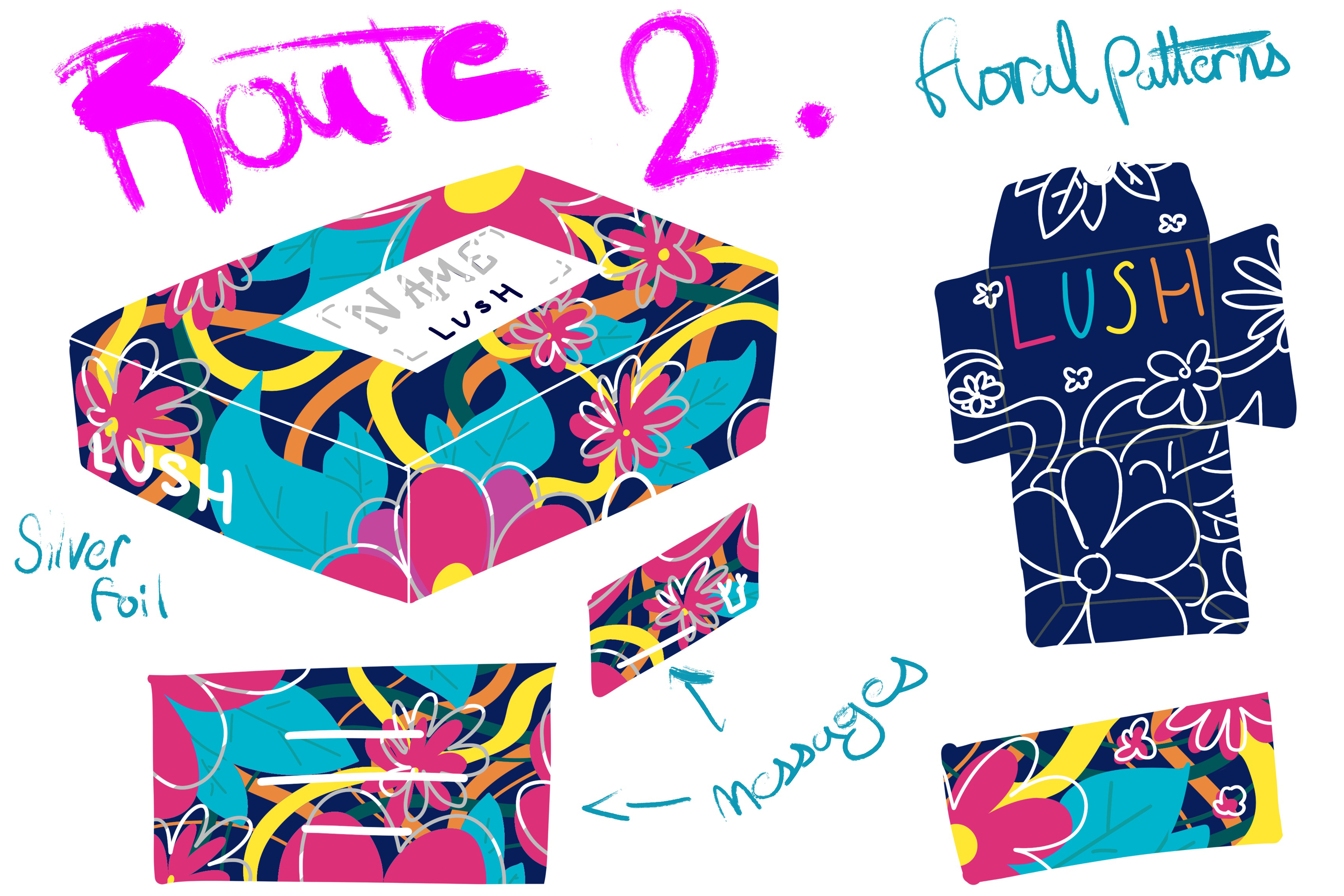
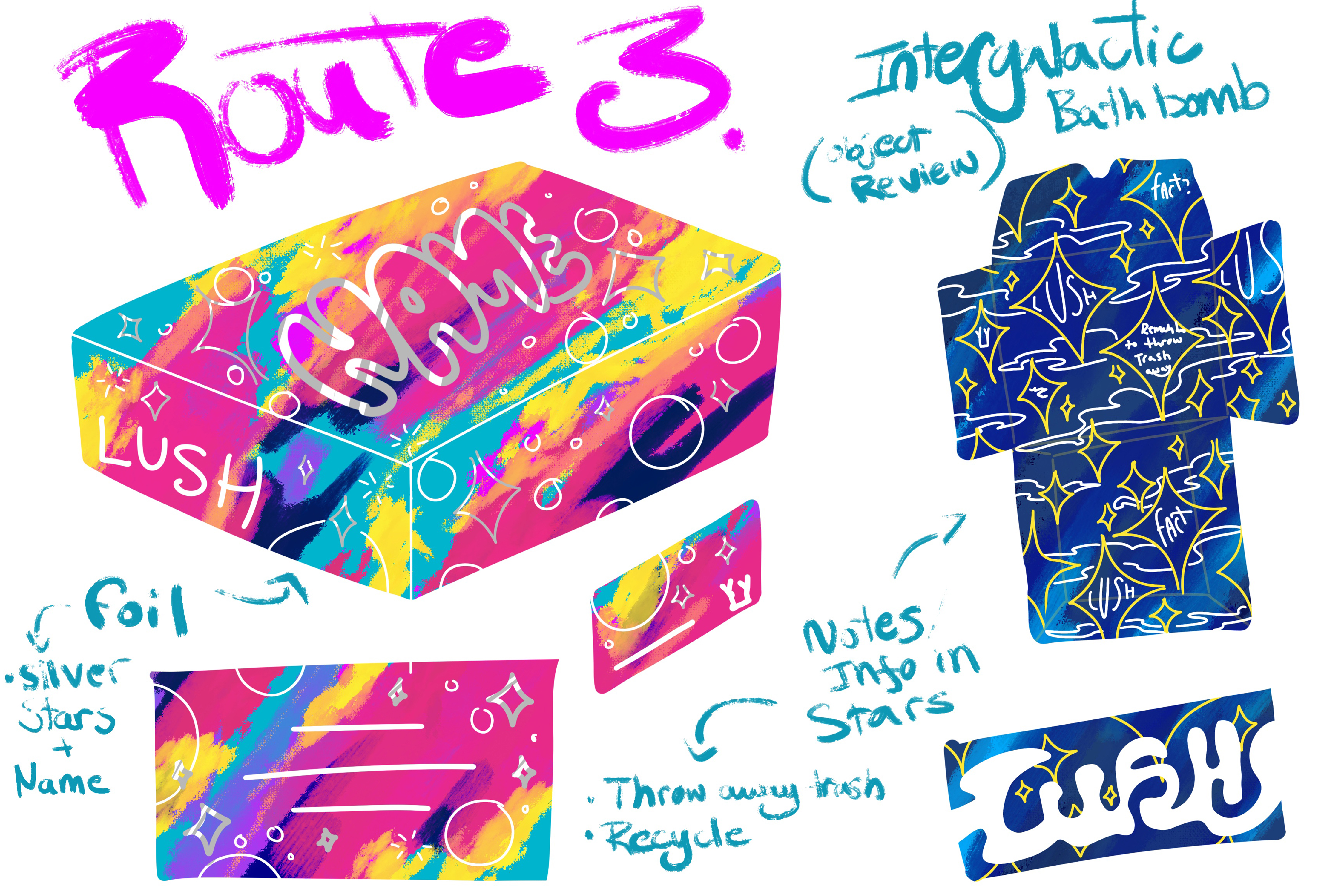
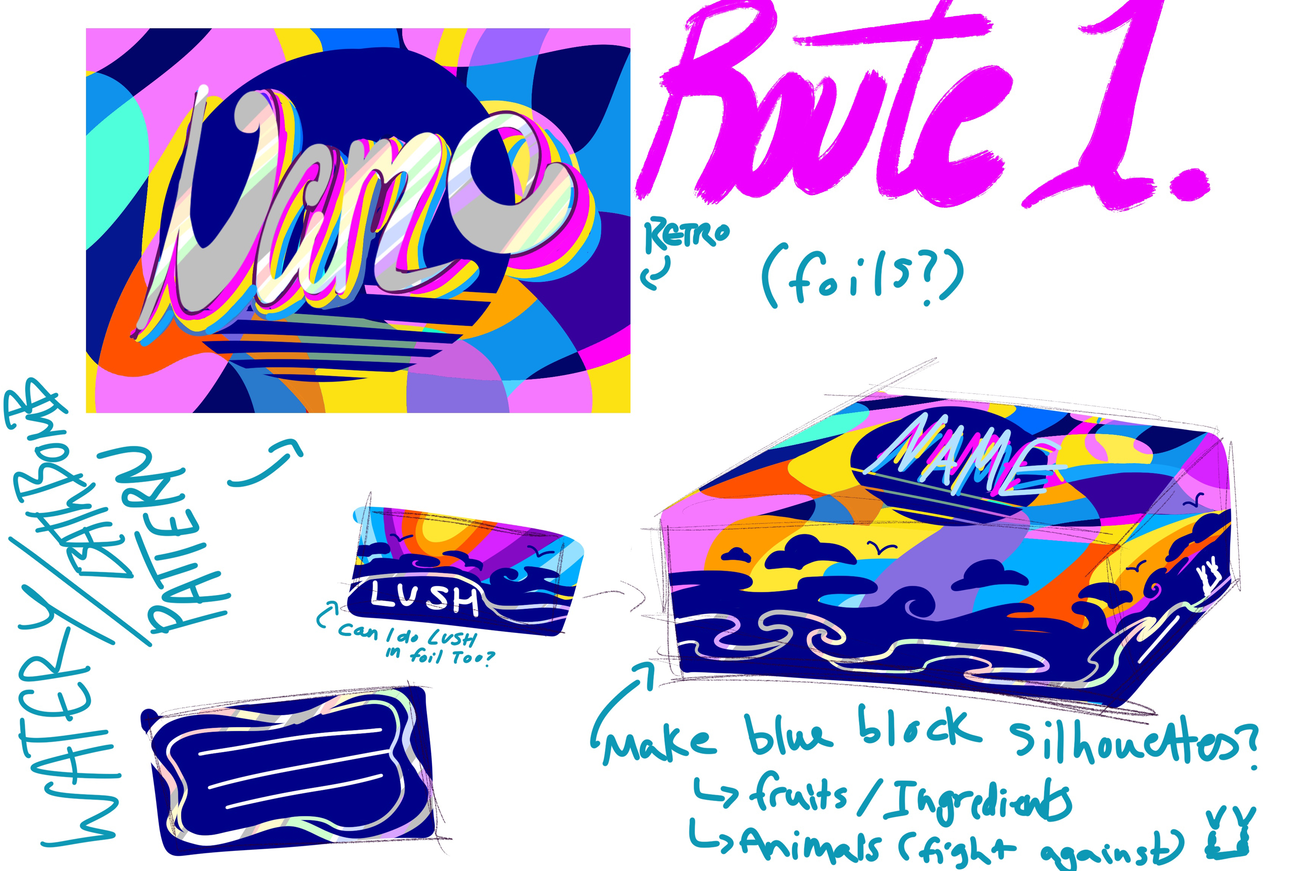
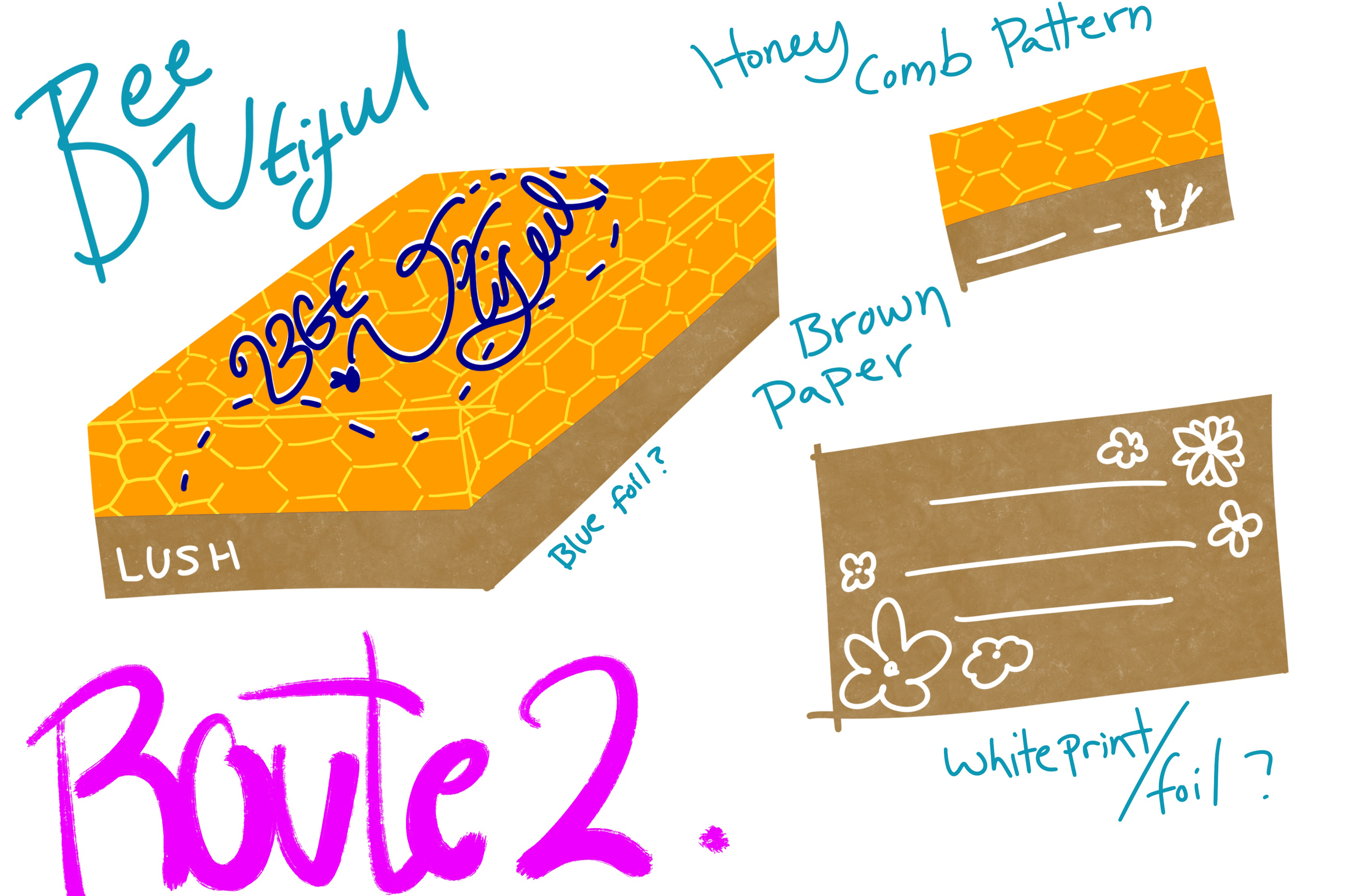
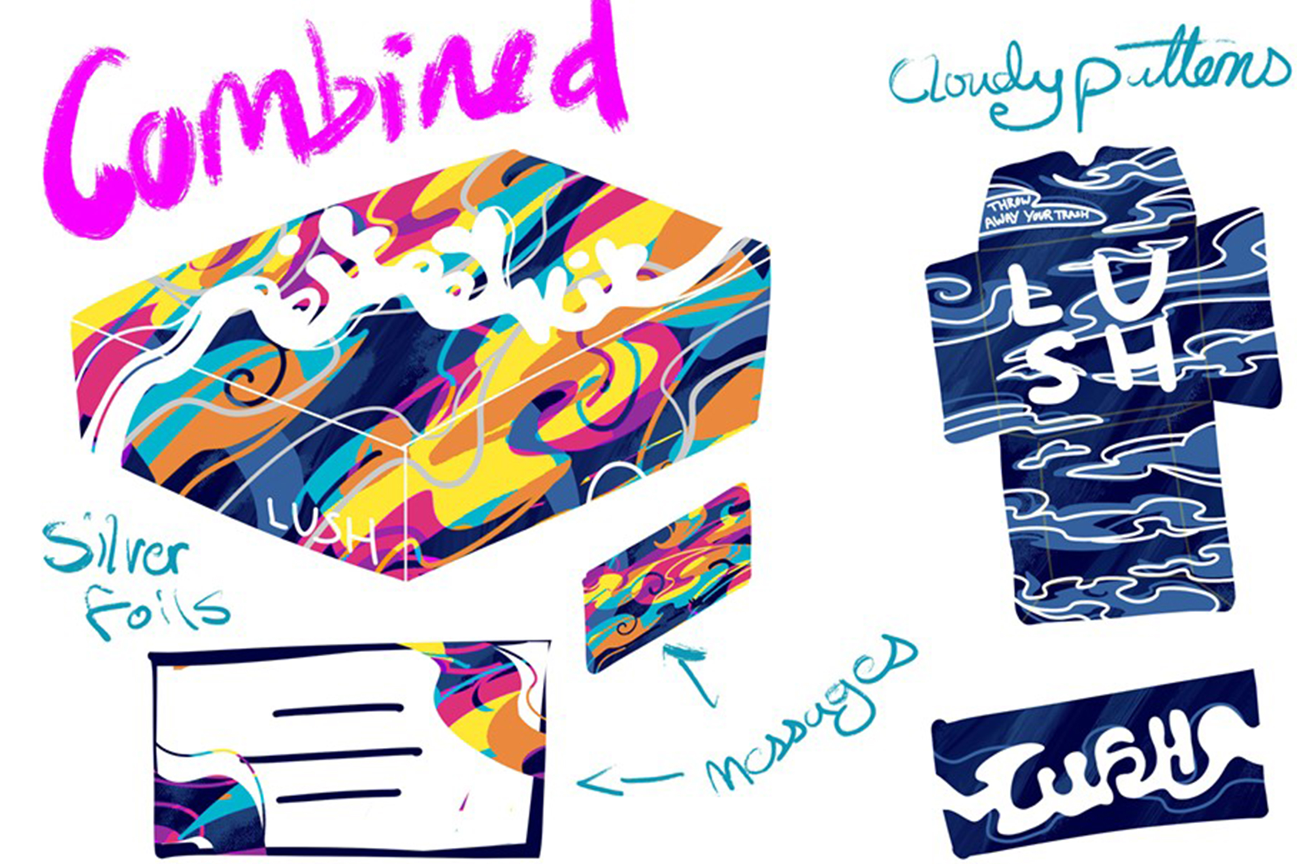
I made a group of different designs, often sticking to a bright colour pallet as Lush tends to use bright colours and I wanted to emulate this. After presenting my ideas to Lush employees I chose to combine some of my ideas together and move forwards with that design.
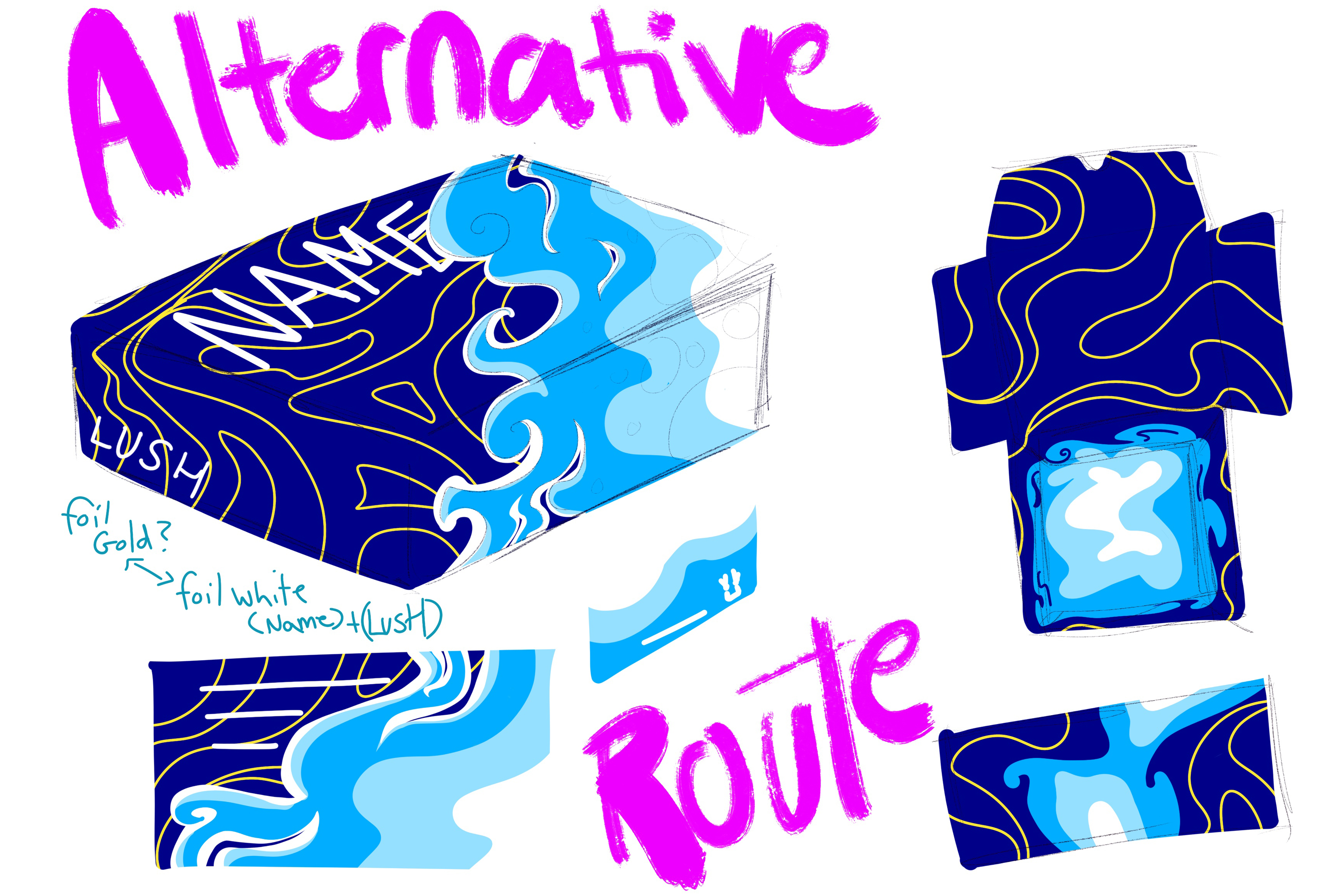
After finishing my design I reviewed how I felt about the colours on the box as well as the design. While I liked the concept, I felt the need to redesign how it was executed, as well as change the logo and redesign the cards to be more interesting, and include something about the products which I intended to be in my toolkit.
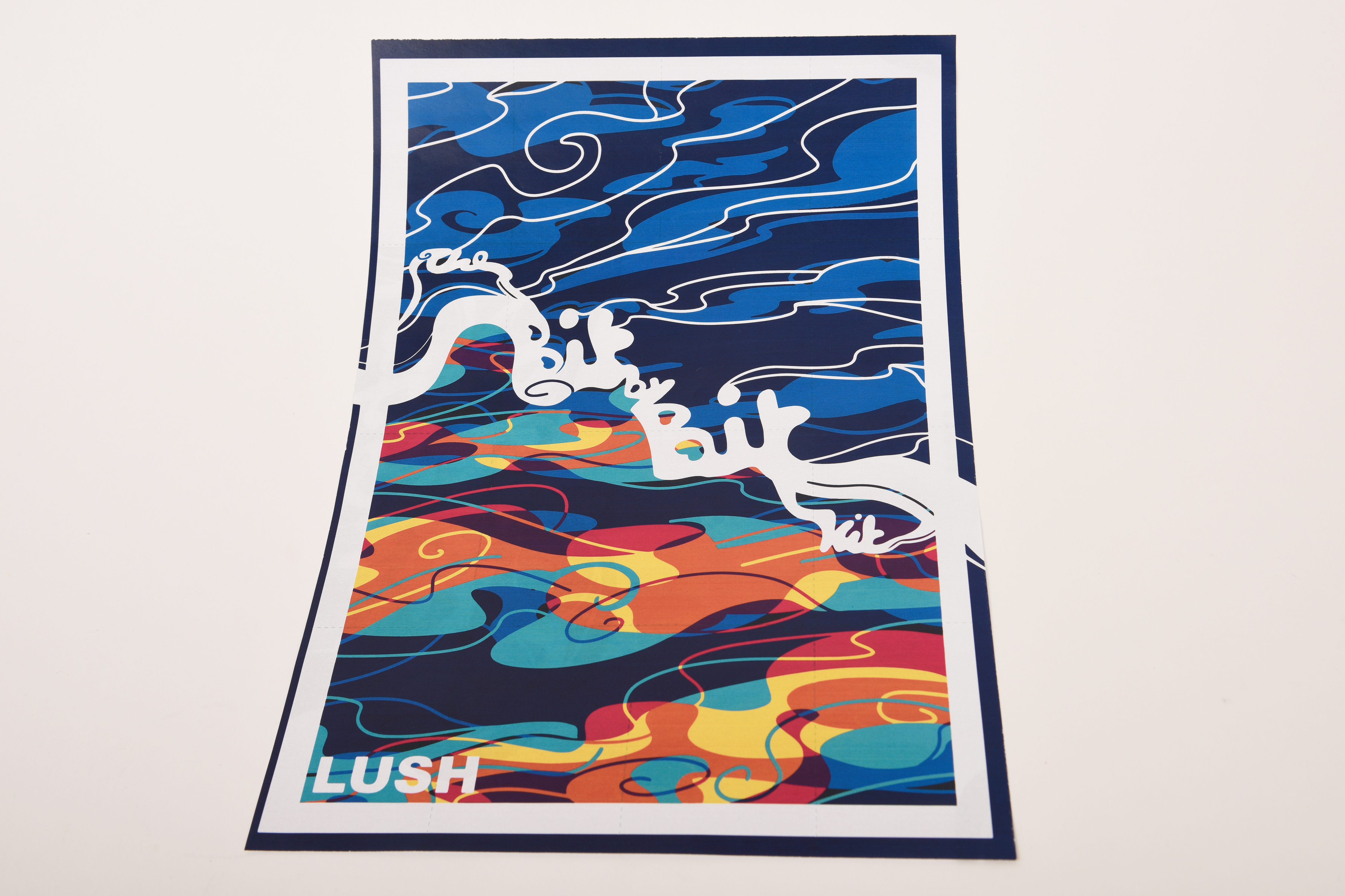
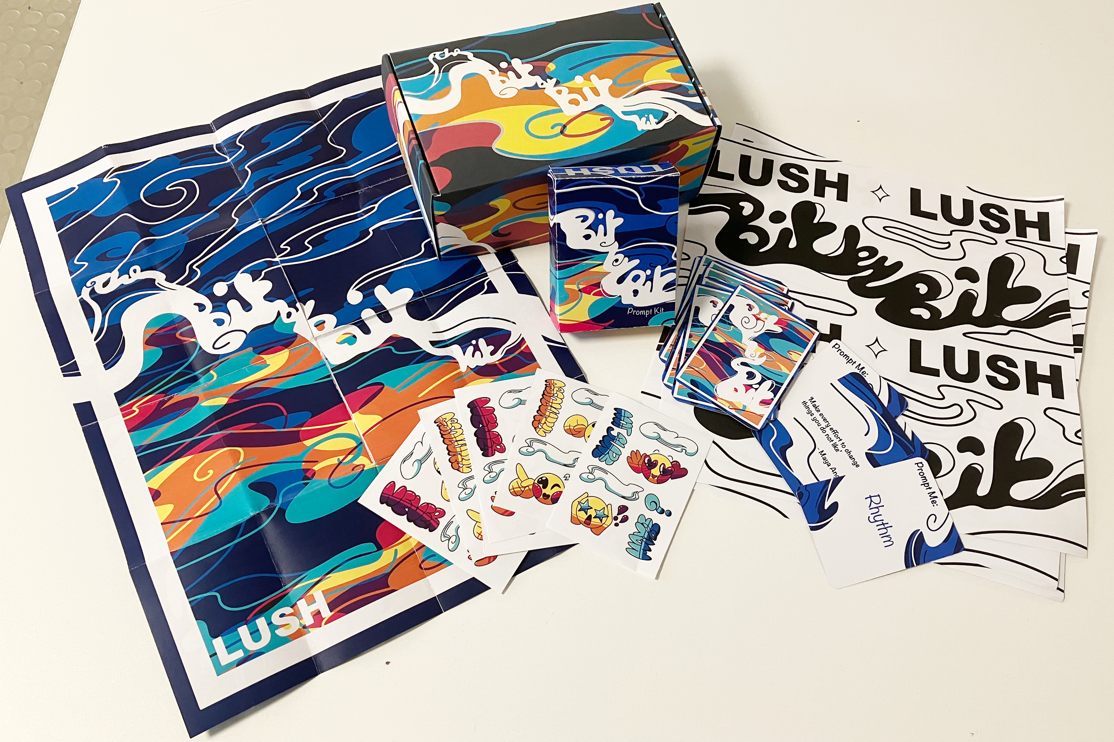
I was a lot happier with my final outcome redesign, I enjoyed my concept, inspiration and bright colour palette which I felt worked very well together.
For a festival I felt this would be bright enough to fit in, while also having the upside of naked products that have no packaging to be left as litter once the event is over, leaving less waste which would be on brand with Lush's ideals.
I was very thankful for the experience of this project, as well as the opportunity to create a product in response to Lush's brief, and get to present our ideas to not only them, but workers at Dayfold print as well.
Thinking back on this project I wish I had reflected on my work sooner, as my final changes were made about a week before the hand in, and too late for the final pitch to Lush. I talked to a few people who looked at my old designs and then compared them to the new ones and they were far more impressed with the newer brighter and more fluid design of my updated toolkit.
While I kept the same base idea I changed quite a lot in my execution because of how unsatisfied I felt with my design at the stage it was at, if I had more time to go back and re-design the rest of that box during the project I would have altered some of the outer and inner design.
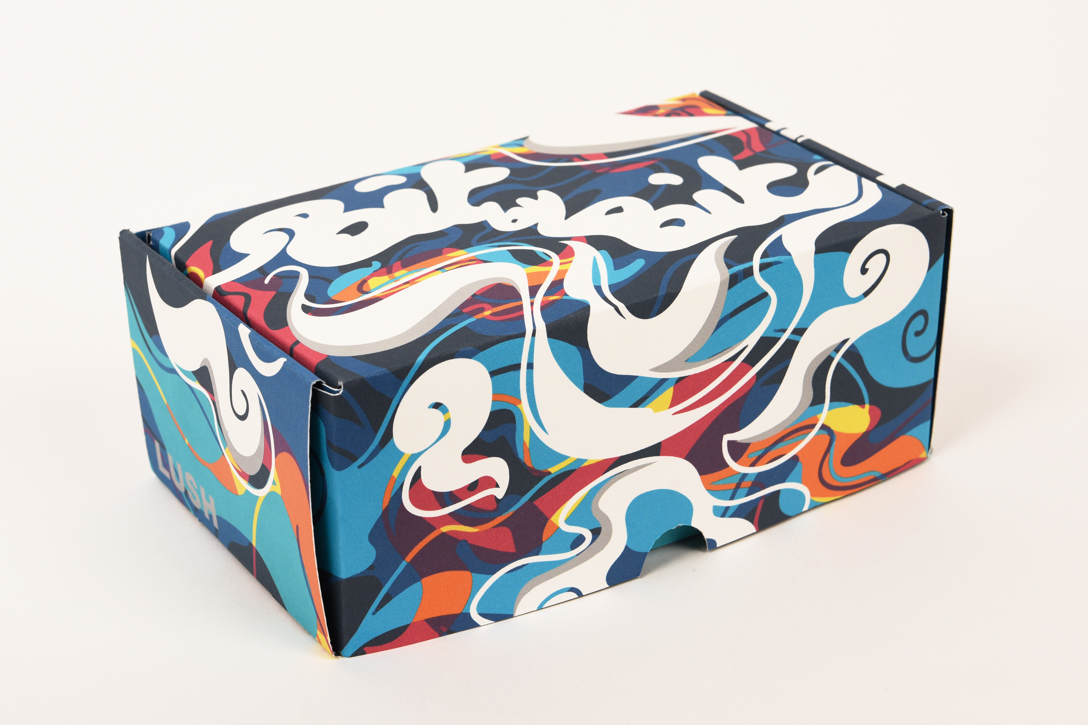
When I was trying to make a hero image it was hard to choose whether to use the inside or the outside of the box as they are both very detailed. I probably could have added less detail on the inside of the box, as it won't ever really been seen with all the products in the way, and it is also an unneccessary waste of ink.
I enjoyed the process of making the box and figuring out how to make my designs line up, and would love a second go, knowing what I do now.