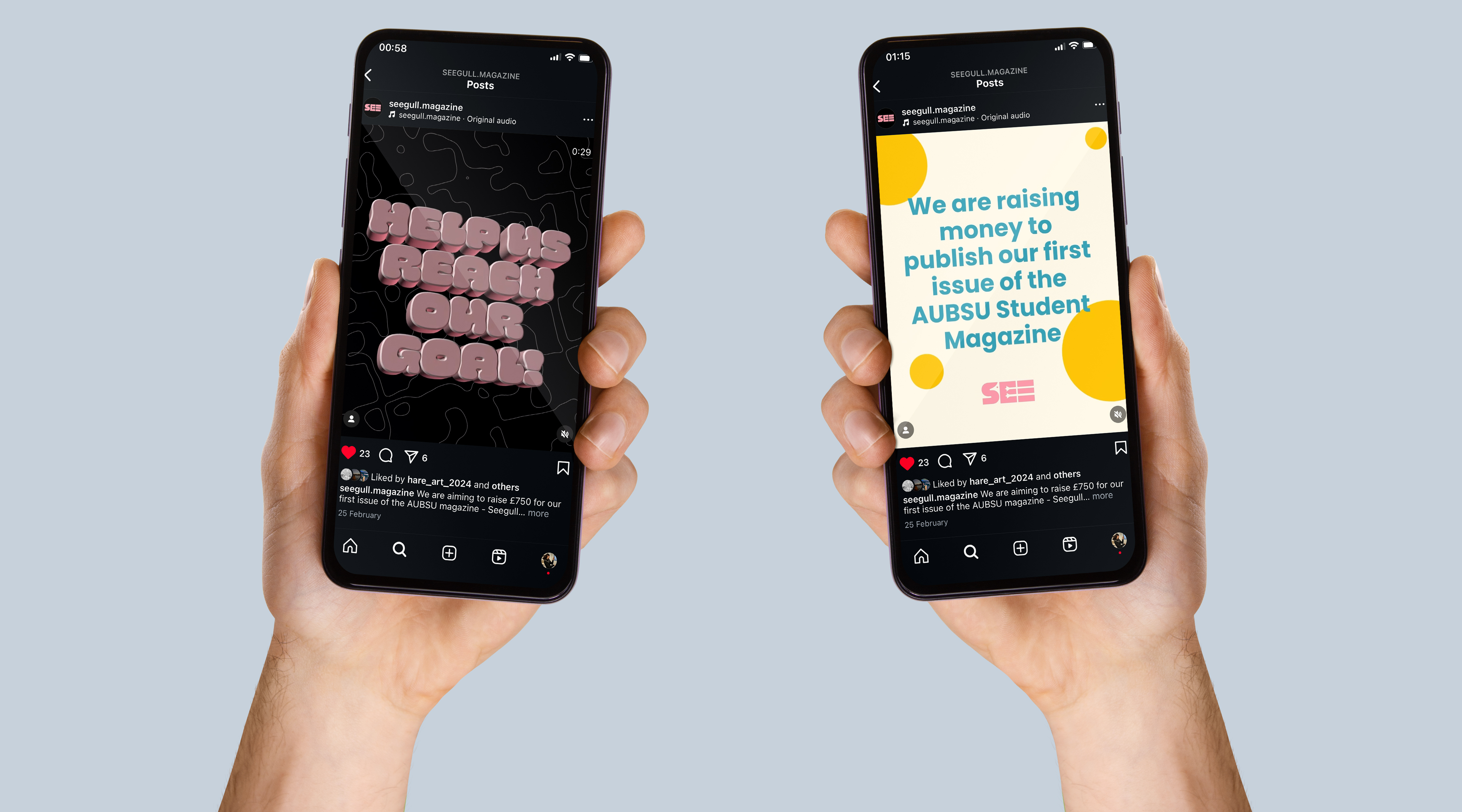
What do I promote a Fundraiser?
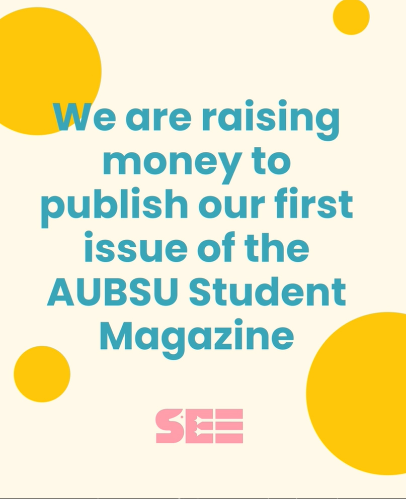
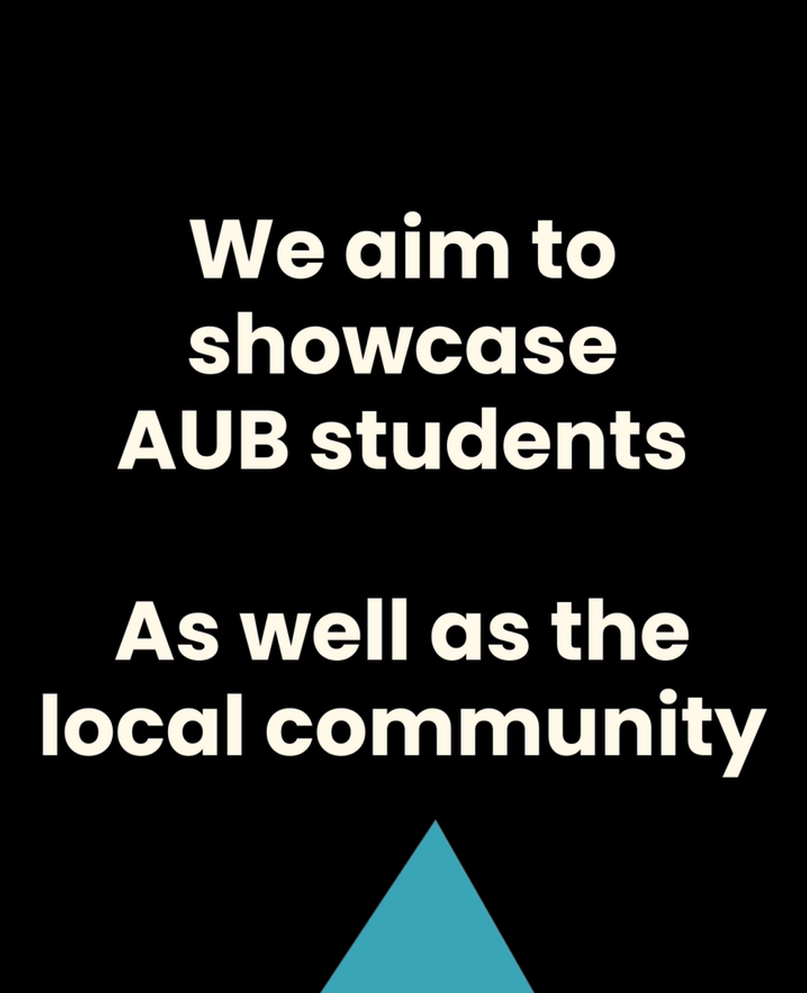
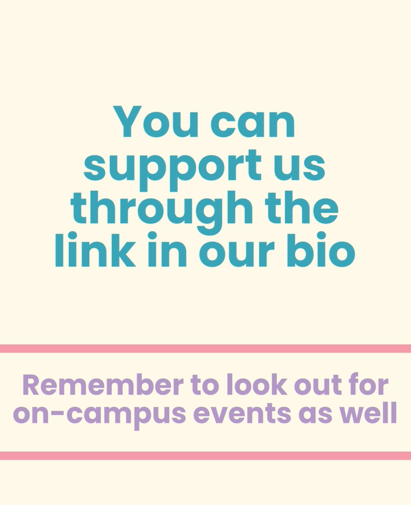
This motion sequence is for social media, to bring awareness to the fundraiser for the AUB student magazine, keeping in the branding choices of the team and aimed at people at AUB
23 Feb - 25Feb
Seegull Magazine
Design a post for social media to promote the fundraiser for the AUB Student Magazine.
After the motion design project, and some reflecting on what I want to do career wise, I chose to switch from the AUB Student Magazine Design team to the Social Media and Marketing team so I could get more experience in this area.
Motion
3D
Typography
Branding
After Effects
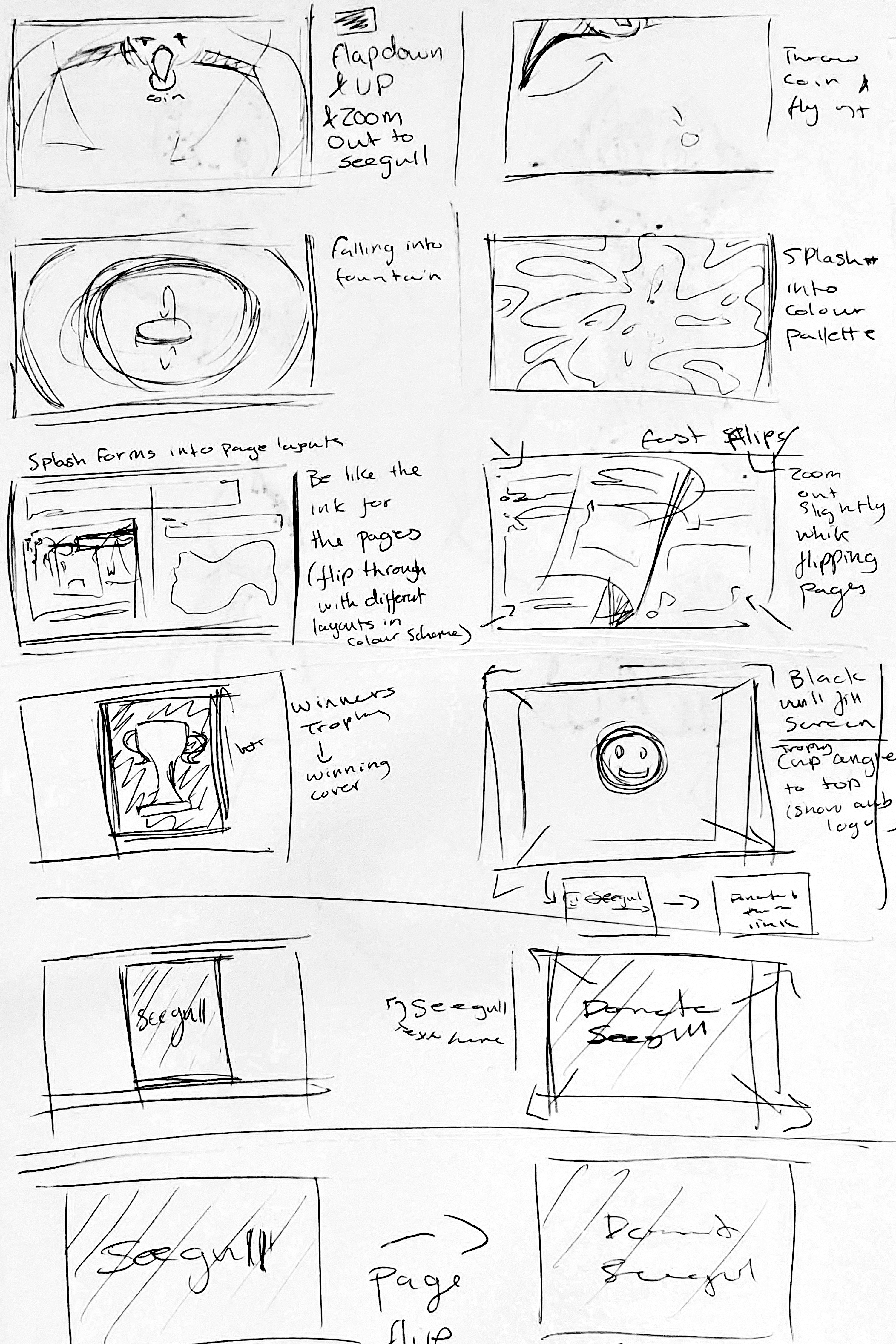
While I enjoyed my inital ideas I needed to think about the time contraints I had for making this project on my own. These ideas included characters, birds and human, which would take too much time to design and animate with me needing to get this done in two days, on top of my uni deadlines coming up.
So I chose to take the typography aspects of the ideas that I liked and created a sequence using those instead.
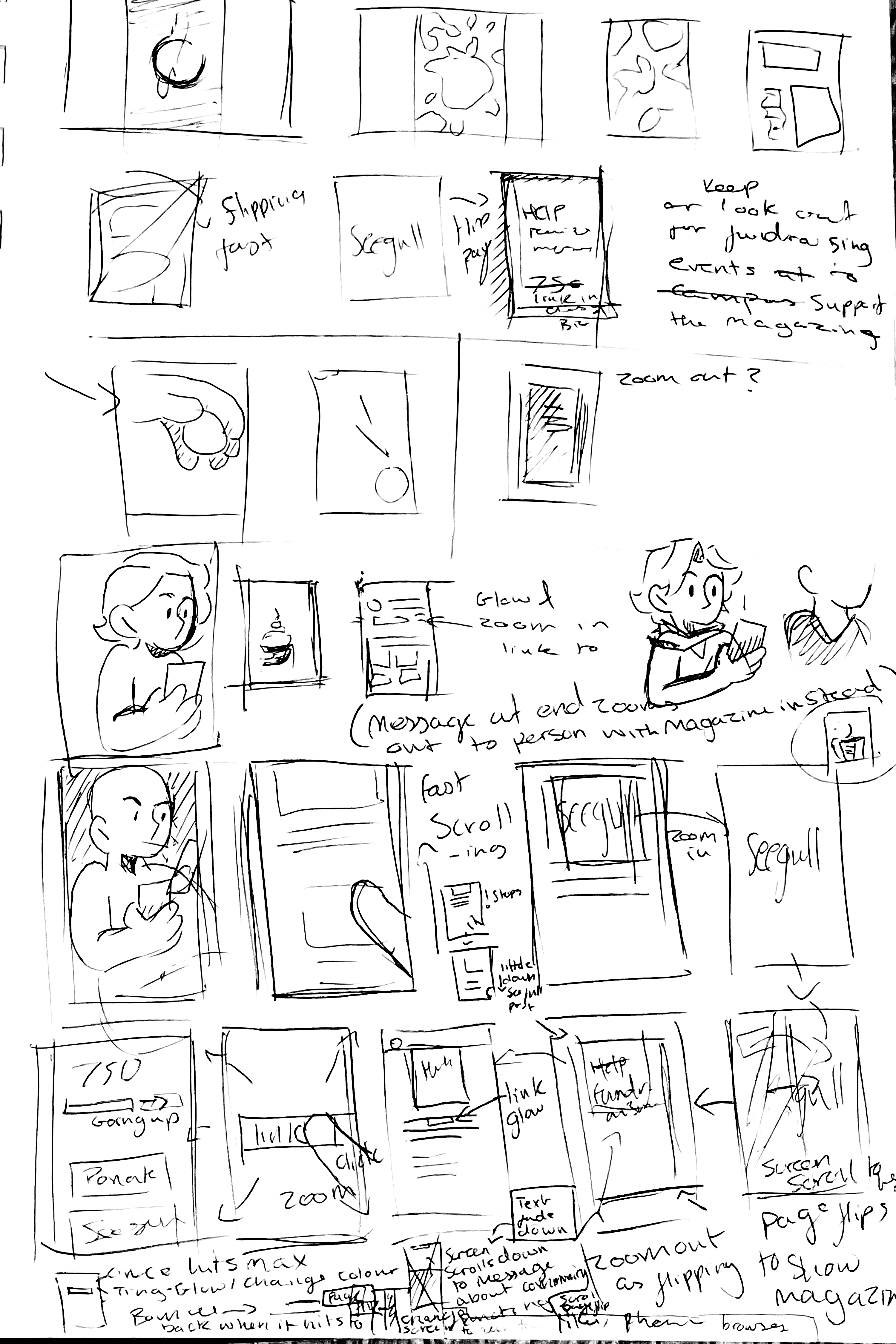
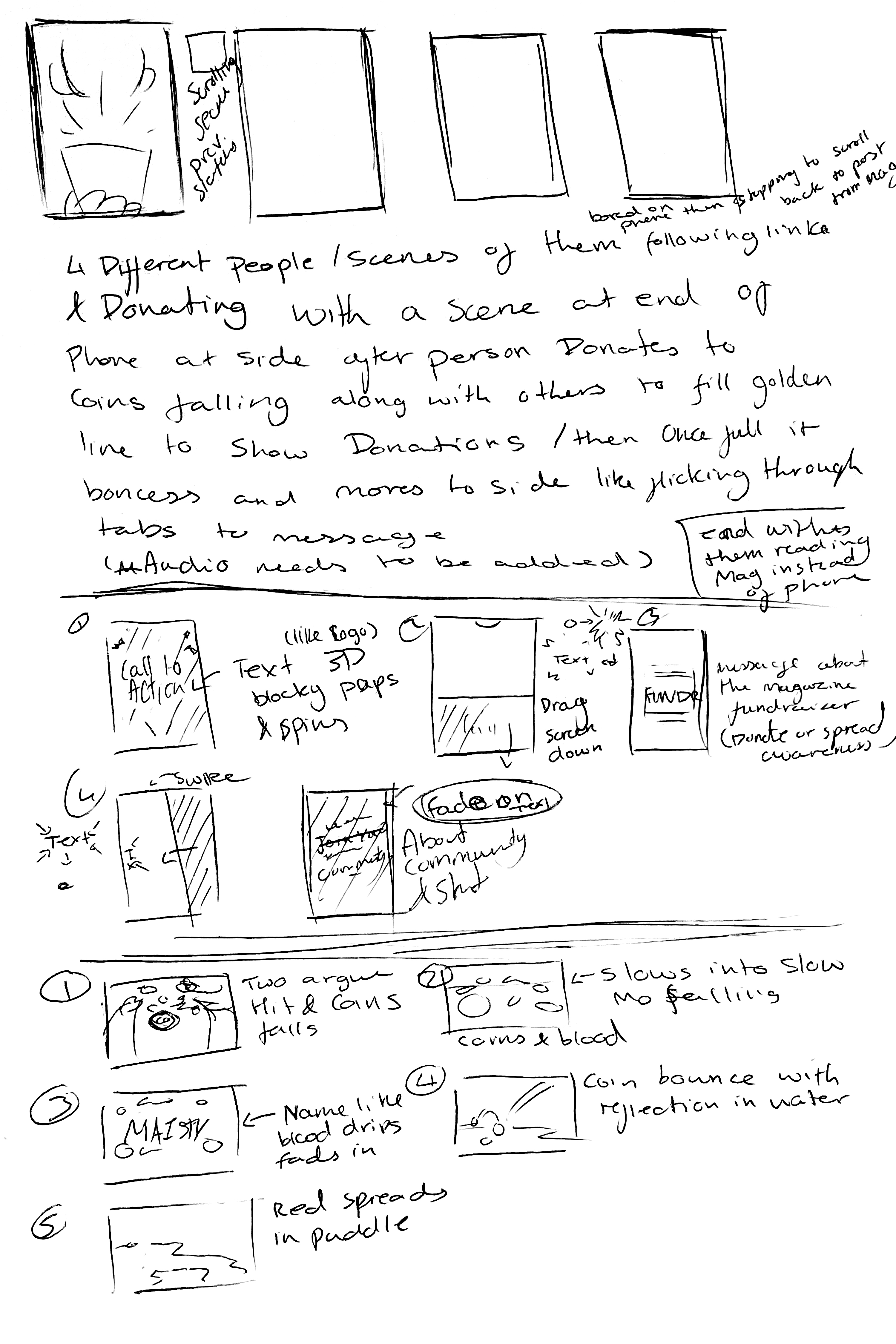
I knew that I needed a scene for each main point I wanted to get across to the viewer, as well as transitions for each scene and something interesting for each to keep attention.
I knew that I wanted the scenes to slide from different angles, almost like swiping a phone screen when on social media.
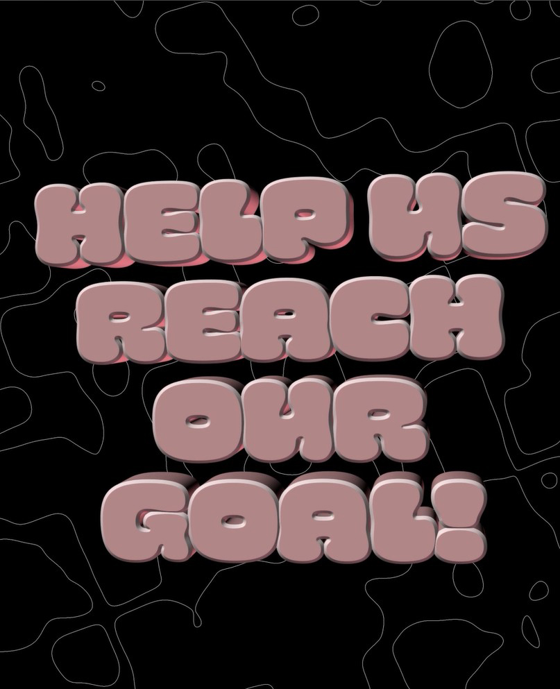
Despite only chosing to do typography and not having a lot of time, I still wanted to push myself with this project, so I decided to try some 3D typography in After Effects as this was something I had wanted to try for a while but had never done before.
so I figured why not start now.
It was actually really interesting to do, and a lot of fun once I got the hang of everything.
I ended up doing a few different transitions, however they were all mostly playing around with scale and positioning.
The 3D and that background are what I am most proud of, although it took a bit to get the hang of, getting the 3D type to twist as it went down into a new scene was a job well done for me.
I also played around with lighting in this scene, as I felt the simple black shadow felt a little boring. I added a bright pink colour from our Magazine's branding guidelines behind the text to make it a little more interesting.
Although I did also do it simply because I was having fun with 3D and wanted to see what would happen if I added more pink.
For the time that I had, and never doing motion in this way before or doing 3D, I am really proud of what I made.
It gets the point across, and I kept the sentences short with enough time that people will be able to read it all.
The small extra animations in the background help to keep attention, and the audio I chose works well, however it's not overly important as I know a lot people using social media don't tend to turn their audio up for something like this post.
I tried a lot of new animation techniques in After Effects that I'm quite proud of for my first time. I'll defiently be doing more 3D in After effects, and I would like to try some in blender as well, as this was really fun and interesting to do.
This project was defiently a good learning experience for me, as well as a rain check on how much I can get done in a certain amount of time, while also being busy with University deadlines.